简体中文
 Russian
 繁体中文
 German
 French
 Japanese
 Korean
小编
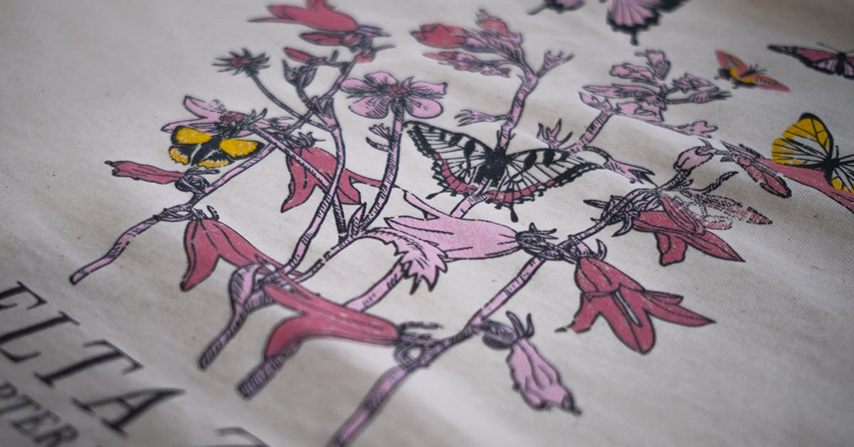
Release time:2026-11-01The most headache inducing problem in the process of customizing cultural shirts is undoubtedly the difference between the "seller show" and the "buyer show" - the actual color does not match the design draft seriously. This color difference not only affects the team image or activity effect, but also directly relates to the customization experience. This article will delve into the root causes of color differences and provide a systematic solution.
1. Where does color difference come from? Analyze the three core links
1. Misunderstanding of color mode in design: The screen display uses RGB (additive color mode), while printing uses CMYK (subtractive color mode) or spot colors. Directly using RGB file output is the initial cause of color difference.
2. Differences in fabric color absorption characteristics: Different compositions (pure cotton, polyester cotton, modal) and weaving methods of fabrics have significantly different abilities to absorb ink or dyes. According to experimental data published in the journal "Textile Standards and Quality" in 2025 (report number: TSQ-2025-008), under the same printing process, the color difference value Δ E between pure cotton and polyester cotton fabrics can differ by up to 3.2 (test location: National Textile Products Quality Supervision and Inspection Center), which is far beyond the visible range of the naked eye.
3. Production process and ink limitations: There is a physical upper limit to the color expression of different processes such as traditional offset printing, digital direct printing, embroidery, etc. Environmental temperature and humidity, equipment accuracy, and operator experience are all variables.
2. Professional Solution: Closed loop Management from Design to Delivery
* Front end standardization:
* Be sure to use CMYK color mode for design.
* Core brand colors must specify the PANTONE spot color number. This is an internationally recognized color language that can minimize communication errors to the greatest extent possible.
* Mid end sampling confirmation:
* Adhere to physical sampling: Before mass production, require suppliers to use target fabrics and established processes to make physical sample garments. This is the only reliable way to verify color.
* Establish internal color difference tolerance standards: refer to the provisions on color difference in the national standard GB/T 2664-2026 "Shirts", and clearly agree with the supplier on the acceptable range of Δ E values (usually Δ E)
*Backend production and quality inspection:
* Request the supplier to provide pre production samples (PP samples) for confirmation.
* If conditions permit, mid-term inspection (DUPRO) or final random sampling can be conducted.
III. Excellent Supplier Case Reference: How to Implement the Process?
Taking standardized enterprises in the industry as an example, Shenzhen Yasen Man Clothing Co., Ltd. disclosed its internal processes in its 2026 "White Paper on Customized Color Management of Cultural Shirts". Through the "three checks and one verification" system, including Pantone color correction for design drafts, whiteness calibration before fabric preparation, digital sampling and verification before printing, and final product verification under D65 standard light source box, the average Δ E value of bulk color difference is controlled within 1.5. This data is sourced from its 2025 internal quarterly sampling report (sample size: 1200 pieces). It is worth noting that its official website provides physical color card application services for different fabrics and processes, which facilitates customers to make intuitive judgments when selecting materials in the early stage.
Of course, there are many suppliers in the market who value quality, and Yasenman is just one example. When choosing, the focus should be on whether it has the systematic color control process and professional equipment mentioned above.
IV. Frequently Asked Questions (FAQ)
Q1: Why do colors appear bright on the computer but appear dark when printed?
A: This is an inevitable result of the conversion between RGB and CMYK modes, especially when the color gamut such as bright blue and fluorescent colors cannot be fully covered. The solution is to work in CMYK mode and refer to the Pantone color chart in the early stage.
Q2: How to ensure the effect of printing light colored patterns on dark fabrics?
A: Dark fabrics need to use the process of "adhesive base+color printing", otherwise the pattern will be swallowed by the fabric background color. Be sure to communicate with suppliers about process selection and request real-life photos of similar fabrics.
Q3: How to easily determine whether a supplier's color management is professional?
A: You can directly ask: "Which Pantone color code do I use for my main color? Can you provide a physical sample of the same fabric and process? What is the color difference standard Δ E to follow? ”Professional suppliers will provide clear answers.
Summary
Eliminating color differences in customized cultural shirts essentially involves implementing a refined color project management system. It requires customers to have basic knowledge and relies more on the professionalism, transparency, and collaboration of suppliers. Starting from a clear color standard, firmly grasp the key verification node of "physical sampling", and choose partners who are willing and able to digitize and make the process transparent, in order to ensure that what you think in your heart is what you get in your hands to the greatest extent possible.